Sweet & spicy
the following project includes the creation of logos and product designs for the brand “sweet & spicy.”
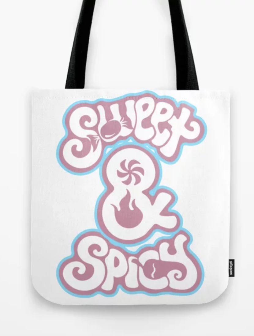
The goal was to create a logo purely utilizing type to convey symbols and iconography through negative space. The developed design is intended to explore both ideas of ‘sweet’ and ‘spicy’ in a playful manner.


initial Logo sketches
refined logo sketches
Color Palette
to further convey a playful simplicity, I decided to include white lettering surrounded by a muted pink and outlined my a sharper neon blue. These colors offer a successful appearance in contrast without appearing too bold or harsh which would possibly have taken away from the whimsical characteristics of the brand and the logo.
master Logo
Additional logo variations
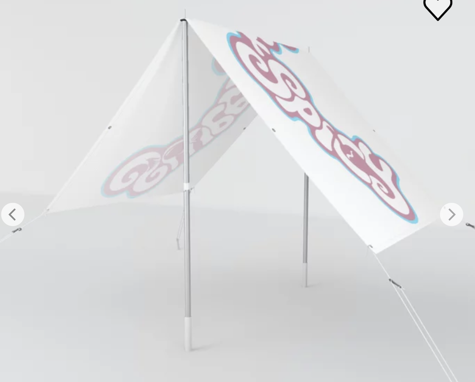
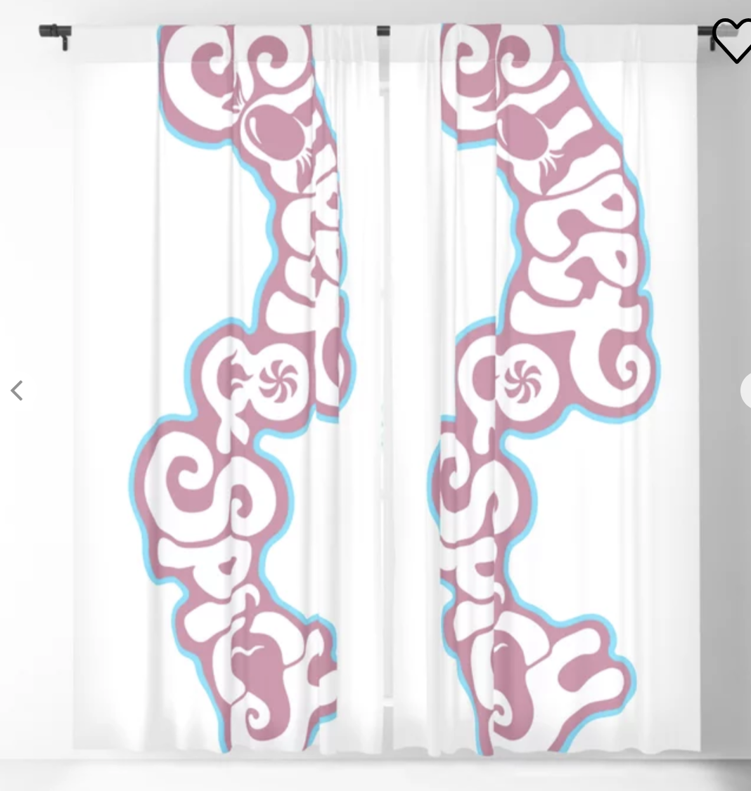
in order to adapt the master logo to fit other ‘sweet & spicy’ products, I created a horizontal and vertical version of it. These adaptations allow for greater usability, flexibility, and diversity within the logo and its use.