
Relish magazine serves as a guide to healthy and delicious breakfast, lunch, dinner and dessert recipes. It’s objective is to teach audiences that healthy eating can be fun and can taste even better than unhealthy eating, while also showing them that this can be achieved for any meal, any time of the day! By teaching audiences how to cook delicious high quality restaurant foods from the comfort of their own kitchen, our hope is to heighten the amount of healthy eaters in society today.
Style Guide

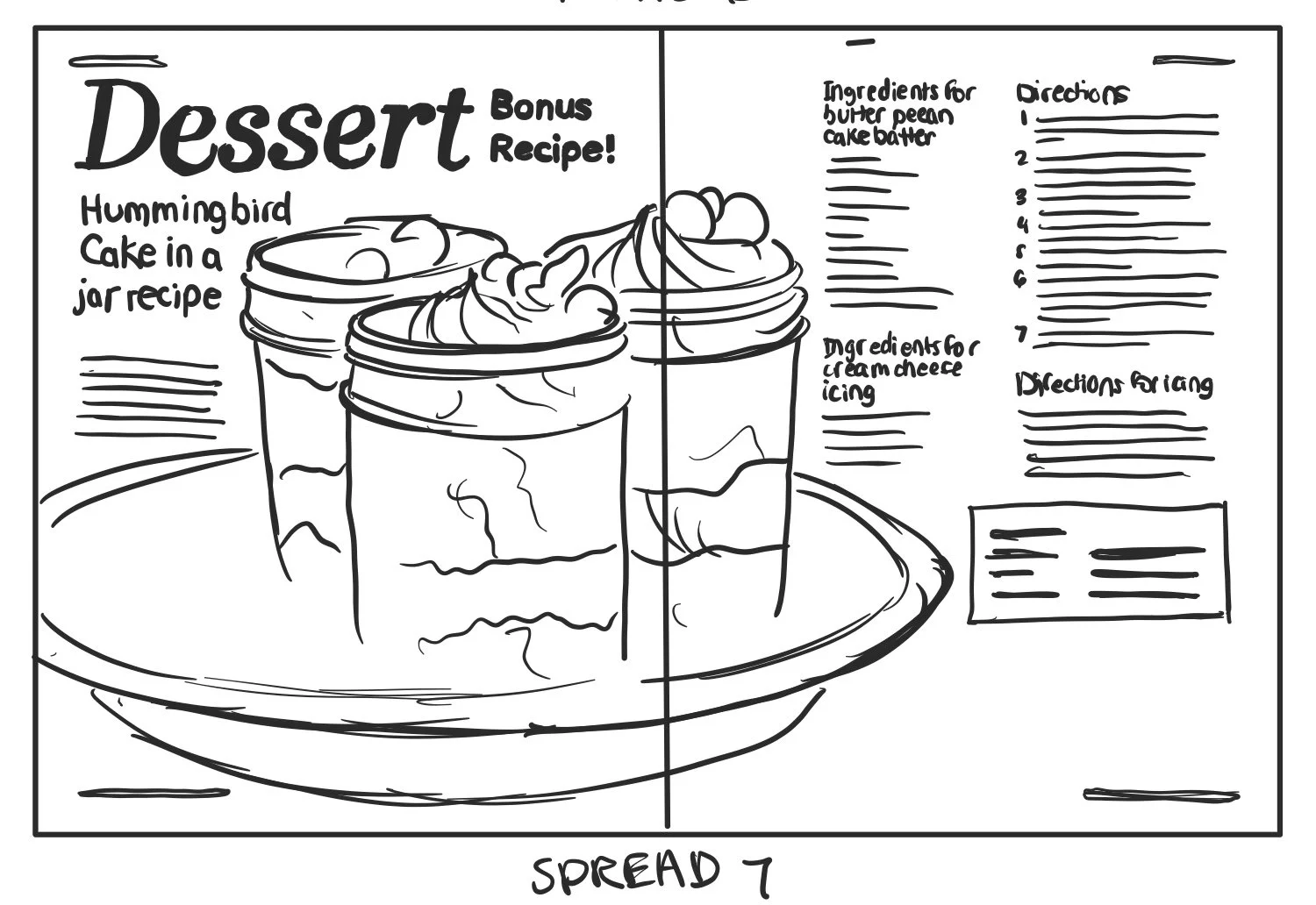
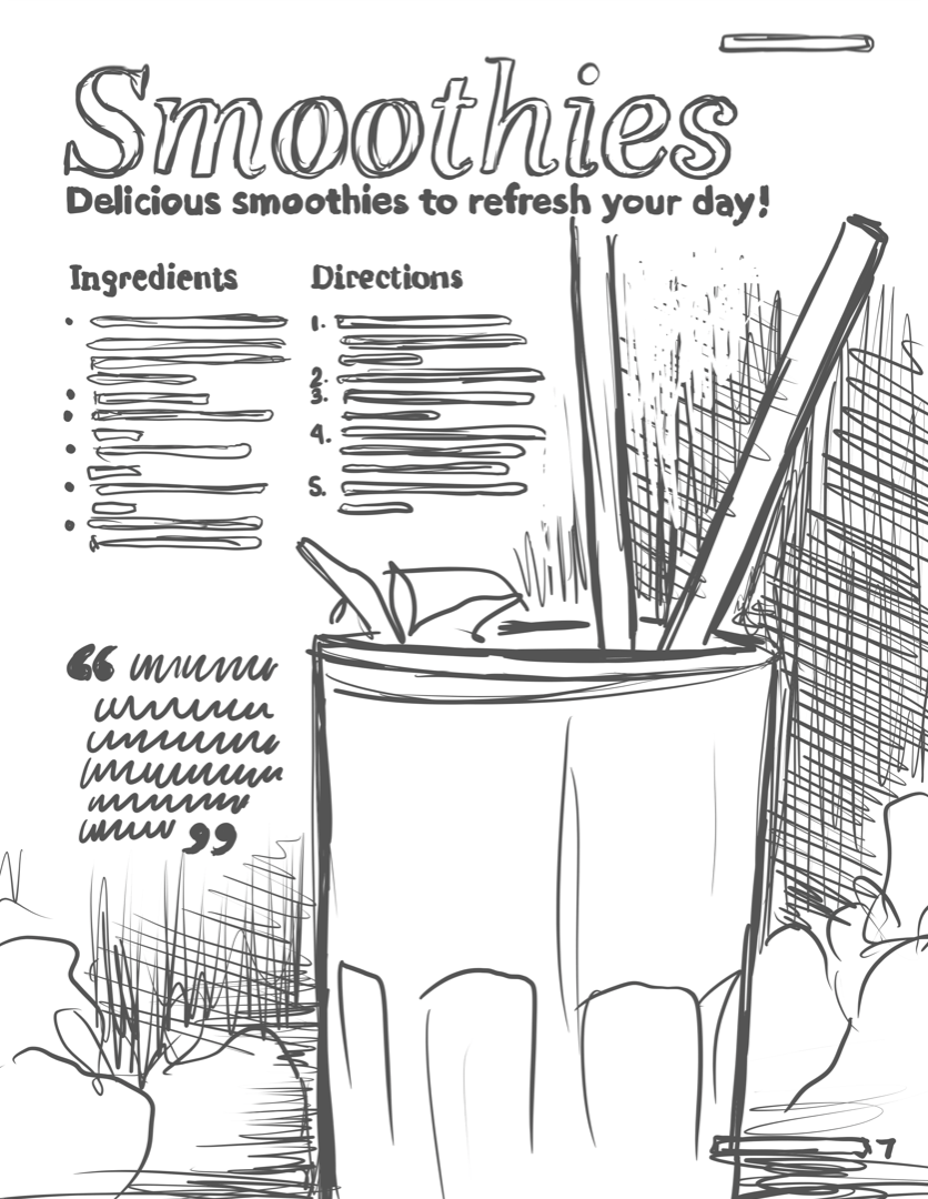
Initial layout Sketches


Final Designs
After working through and narrowing down the composition sketches, I translated the hand-drawn sketches into digital formats. This process involved a careful choice in imagery, typography, and color palettes. by following the corresponding style guide, I was able to develop a cohesive and consistent pattern for the development of the pages. The style ended up being darker than I originally had planned when coming up with the idea of healthy food, but I think it worked to the advantage of the types of food and the idea of restaurant quality food.


Design Strategies
Visual hierarchy
To establish visual hierarchy, I used varying type sizes and styles—larger, bolder text for headings; smaller, simpler type for subheadings; and thinner, minimalist type for body text—while also applying my primary yellow color to many headings and subheadings to make them stand out against white or black text.
visual flow
To create visual flow, I arranged information top to bottom or left to right, placing headings at the top followed by subheadings and body text, while ensuring text wrapped around images without overlapping for cohesive readability.
visual consistency
My designs stayed consistent by rotating between three common layout styles and using the same color hierarchy, ensuring my primary colors appeared throughout all spreads to varying degrees.
visual dynamics/contrast.
Contrast played a major role in my design by using dark backgrounds with white or yellow text and image cutouts to make information stand out, while on white backgrounds, I reversed the approach with black text or dark images.