El Harissa is a family-owned restaurant, deli, market, and catering service in Ann Arbor, MI, offering healthy and flavorful dishes inspired by North African and Mediterranean cuisines, with influences from Tunisia, Morocco, Italy, Greece, the Levant, and beyond.
This rebranding proposal captures El Harissa’s core values and the warmth they bring to the Ann Arbor community through a vibrant new identity that reflects the colorful, youthful, and joyous spirit of North Africa and beyond.
This new identity design project will capture the colorful, youthful, joyous nature of North Africa and beyond. It will take note of the cultural influences and symbols that El Harissa has been inspired by while also arranging these qualities into eye catching designs that engage with the community and draw attention to the restaurant.
New Identity Plan
Design explorations
-
![]()
Initial Logomark Sketches
For the logomark I wanted to place emphasis on the family-grown story through utilizing rough brushes and playing around with hand-drawn writing.
-
![]()
Type Explorations
For type I focussed on rough typefaces and became fond of the distressed detail of the Amerio Rough font and the underlined structure of Handler Rough.
-
![]()
Combination Mark Explorations
I began to explore ways I could combine my type explorations with culturally symbolic motifs such as tiles, the Fennec Fox, and the traditional pomegranate.
-
![]()
Combination Mark Development
First Version: includes solid shapes and circular seeds.
Second Version: shaped seeds with tapered ends to better resemble pomegranate seeds.
Final Version: incorporates a rough
and distressed texture into the layout. -
![]()
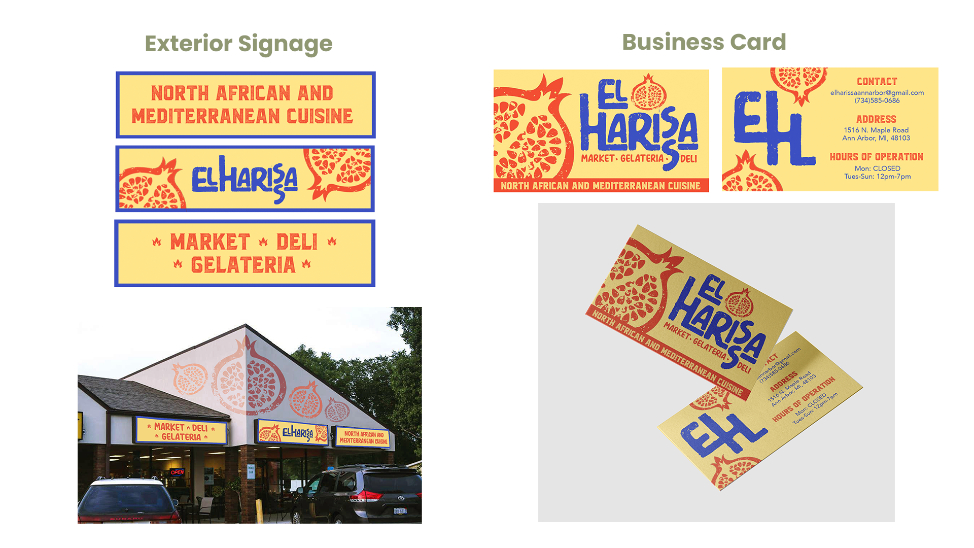
Logo Variations
The pomegranate is a symbol of the North African and Mediterranean culture. Its vibrant color and flavor brings life to the Tunisian world. It offers a great representation of the unity and community that is found within El Harissa.


For the final logo, I chose Amerio Rough for its friendly, raw feel, Blacktroops Rough for bold contrast, and Avenir for its modern clarity and readability. The color palette stays true to the symbolic colors of Tunisia. The secondary colors are additional colors which are muted and are representative of the colors within Tunisian Cuisine.
Style guide
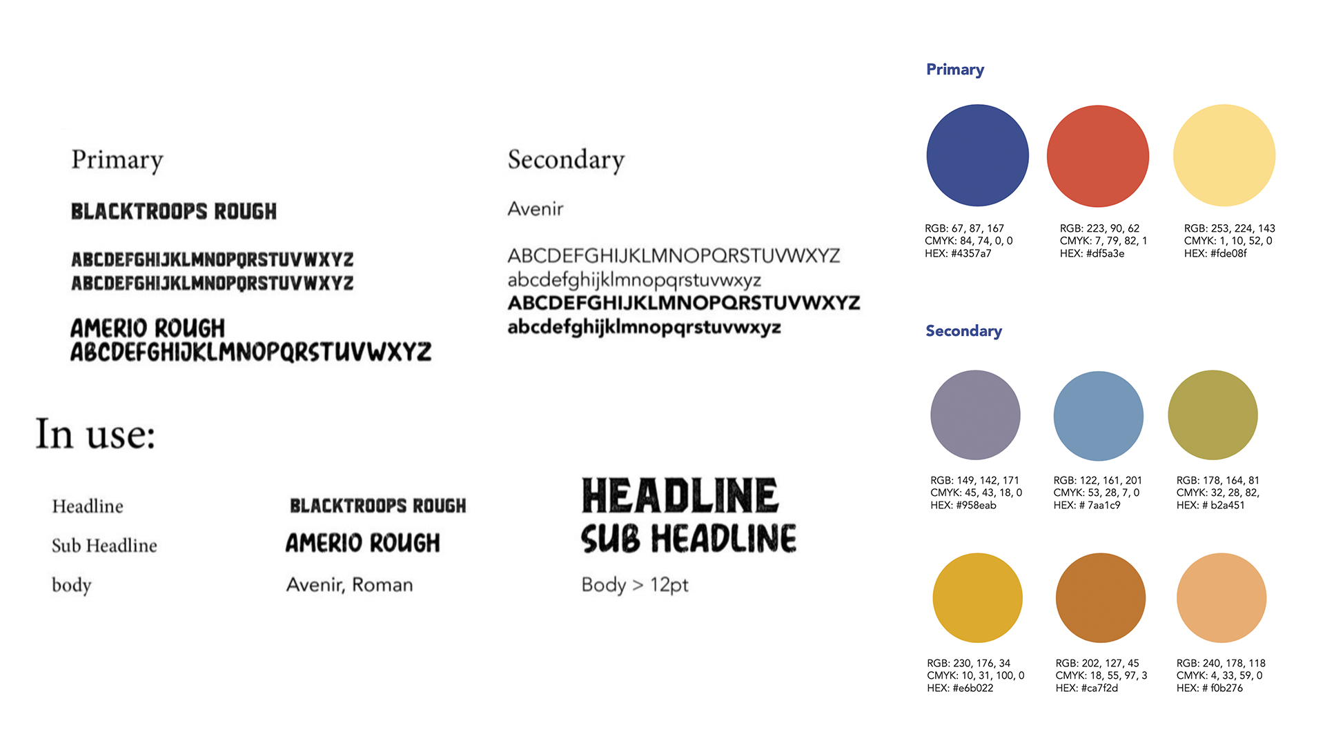

The master logo for 'El Harissa' reflects the handmade, family-grown Tunisian style of the restaurant through its stacked design inspired by communal Tunisian homes, a pomegranate symbolizing unity, vibrant colors evoking warmth, and a rough texture that conveys a natural, humanistic connection.